10 Drawing Materials and Tools for Beginners

http://amzn.to/1LD898i

Most of us started drawing when we were young. Back then, materials and tools were not that important to us. Perhaps, they weren’t even considered. A standard pencil on some notebook paper would often “do the trick”.
But as we grew and developed as artists, the materials and tools that we chose became more important. The connection between quality art materials and quality artwork becomes noticeable along the way and it’s no wonder that emerging artists desire to have the very best materials possible.
If you are starting to get serious about your artwork, no matter what age, you may also be starting to get serious about the materials that you use.
In this post, I’ll offer 10 essential drawing materials and tools for artists that are just starting to get serious about their drawing. (This list is focused on black and white media only)

1. Quality Drawing Pencils

We’ll start off with the most obvious essential – quality drawing pencils. When it comes to drawing pencils, each artist will find a brand that they connect with. There’s no way to know which brand will become your favorite until you try a few.
Drawing Pencil Sets

Pencil sets usually come packaged in nice tins and can be great because they often include the full spectrum of graphite grades. Many sets include pencils with harder graphite (9H) through softer graphite (6B).  Harder graphite makes lighter marks and keeps a sharp tip longer, while softer graphite makes a darker mark, but needs constant resharpening. These sets give the artist the ability to work with many different values and varieties of mark.
Individual Pencils
Many artists will find that they don’t use all of the pencils in a drawing pencil set.  Instead, they may find that they only use a few of the pencils.  For example, 2H, HB, 2B, and 4B pencils would be plenty of range for most of us.  If this is the case, then a pencil set would not make sense.  Instead, purchasing the individual pencils as they are needed is a more logical approach.

2. A Sketchbook


A sketchbook is one of the most important things an artist can have. I should point out that I am referring to an “active sketchbook” – one that receives attention on a daily basis.   Anyone can “own” a book with blank pages of drawing paper. But the one that actively gets drawn in on a daily basis is the one of value.
Let me make an analogy to a sketchbook’s importance.  Let’s compare a professional athlete’s life to that of an artist’s.
The professional athlete may workout for hours daily in the gym or on the track to enhance their performance on “game day”.  Though the world may never see the hours of hard work that have been put into the workout, the exercise is important – if not crucial to the athlete’s success.
An active sketchbook is the artist’s “exercise”. It is the “hard work” that goes into the development of the artist and it is the breeding ground for innovative, artistic ideas.  Though the sketchbook may never be seen by the world, it is the often driving factor in successful artworks and successful artists.

3. Quality Drawing Surfaces

A drawing can be made on any surface, but the quality of that surface is sometimes just as important as the medium that it is used upon it.
There are a few considerations for choosing a drawing surface that will affect the finished result.
1. The “Tooth” – The “tooth” of the surface is the texture of the paper.  The texture of the paper plays a role in how the drawing material is accepted on the surface.  Heavier textures will produces lines that may appear “broken”, while smoother textures will produce smoother lines and gradations of value.  Some artists will prefer heavier textures while others will prefer a smoother surface.
2. Paper Weight – The weight of the paper refers to how much a ream (500 sheets) of that paper weighs.  For most papers, the weight of the paper will be directly related to the thickness of the paper. ( It should be noted that some papers may have a heavier weight but actually be thinner.)  For example, 80 lb. paper will typically be thicker than 60 lb. paper, while 100 lb. paper will be heavier than 80 lb. paper.
3. Acid Free – Paper that is “acid free”, without going into all of the technical details, will stand “the test of time”.  This paper is will not yellow over time and is more resistant to fading that can occur when exposed to UV light.
Here are few recommended papers that you might experiment with…
Drawing Paper- Medium tooth paper that is suited for drawing with a variety of drawing media including graphite, charcoal, and colored pencils.
Charcoal paper- Heavier tooth paper that is lightweight – almost semi-transparent.  Excellent for creating texture.  (A variety of media can be used on charcoal paper – not just charcoal)
Bristol Paper- Smooth tooth paper that is heavier (think cardstock).  Excellent for creating smooth gradations of value, or detailed line work with ink.

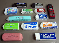
4. Variety of Erasers

http://amzn.to/1LD7mEi 

Erasers are for mistakes – right?  Think again. Erasers can be a great mark-making tool as well.  Each eraser creates a different mark and should be used as necessary according to the specific drawing medium.
Here are a few recommended erasers…
Rubber Eraser – Your standard eraser for erasing graphite.  This eraser uses friction to remove any material from the surface.
Kneaded Eraser – This eraser lifts material from the surface, instead of using friction to remove it.  It can be pulled and fashioned into different forms to create specific marks.  This eraser gets dirty over time, but can be cleaned by pulling and “kneading” it.
Gum Eraser – “The Crumbler”.  This eraser is great for removing media from surfaces that are sensitive to tearing.  A gum eraser removes the medium through friction, but crumbles as it does so – preserving the surface.
Vinyl or Plastic Erasers – This eraser is the toughest of the bunch.  It can erase almost anything.  But be warned – this eraser can tear the paper if you’re not careful.

5. A Good Pencil Sharpener

Pencils need to be sharpened with a quality pencil sharpener.  Use a poor quality sharpener and you could be out of a pencil in a matter of moments.
Pencil sharpeners generally fall into two categories – Manual and electric.
Electric Pencil Sharpeners
http://amzn.to/1LD7vaA
Electric pencil sharpeners can vary in price and the old saying, “you get what you pay for” is true for what you get here.
A quality electric pencil sharpener will sharpen your pencil without eating it all up.
Electric pencil sharpeners are nice to have for a quick sharpen of the pencil, but should not be used with colored pencils.  The waxy binder found in colored pencils can build up within the blades of the sharpener, ruining the device.
An Extreme Solution
I’ve had the pleasure of working with the X-Acto Commercial  sharpener.  It is a MAJOR pencil sharpener.  One negative is that smaller pencils can get caught inside of the sharpener.  This sharpener is definitely on the extreme side of things, but a cool commodity to have around.
Manual Pencil Sharpeners
While an electric pencil sharpener has its appeal, a manual pencil sharpener will do for most of us.
Like electric pencil sharpeners, the manual varieties come in different forms.  My favorite is a simple, handheld metal sharpener.  It’s a cheap and easy solution that is portable and easily replaced.

6. Charcoal or Conté

http://amzn.to/1La69yC
There are more options to black and white drawing other than drawing with graphite.  No artist’s toolkit would be complete without charcoal or conté.
Charcoal provides a broader range of value and mark-making than what’s possible with graphite.  The manner in which marks are made is different as well.
Charcoal comes in both stick and pencil form.  Sticks of charcoal are usually either “vine” or “compressed”.  Vine charcoal is softer and produces lighter marks, while compressed charcoal – which is concentrated, produces darker marks.
Charcoal pencils can be sharpened like graphite pencils, making them great for details.
Conté is similar to charcoal in richness of color – however the makeup of the material is different.  Charcoal is burnt organic material, while conté is made of clay constituents.

7. A Felt Tip Pen

http://amzn.to/1LD7GTi

I absolutely love felt tip pens. Felt tip pens allow the artist to create a variety of marks. The tip of the pen allows the artist to create a broad range of line quality.
An added benefit to a felt tip pen is the psychological effect that it can have on the artist.
Using a medium that cannot be erased forces the artist to be more deliberate with their marks.  As a result, a bit more thought is put into the marks that are made.  You can actually improve your drawing skill by using a felt tip pen.

8. Blending Stumps / Tortillions

http://amzn.to/1jf0YGS
Blending stumps are essential for the artist wanting to smudge or move material around on the surface.  A blending stump allows the artist to create gradations in value without introducing the oils of the finger (through finger smudging) which can make a drawing look dirty or uncontrolled.
Blending stumps also allow the artist to create gradations and smooth applications of value in areas of detail that may be hard to  get to otherwise.
You can learn more about using blending stumps and blending tortillions in drawings here.

9. Artwork Storage


Your artwork is important.  Even those works that you’d rather not let anyone else see are important.  They need to be treated with respect and stored in manner that will keep them preserved and protected.
There are more than a few options for storing artwork, but the most popular option is a portfolio.
There are many different portfolio options out there on the market – each with their own benefits and drawbacks.  If you are looking to add a portfolio to your collection, I would suggest looking for a couple features.
1. Rigidness –  Look for a portfolio that will keep your artwork from bending.  Most portfolios will do this, but there are a few cheaper versions that may not.  Look for a portfolio that has a rigid support system.
2. Size – When purchasing a portfolio to store your work, be sure that you provide yourself some room for larger works.  Don’t just purchase the 18″ by 24″ portfolio because all of your works up to this point are smaller than this size.  Chances are good that you’ll produce drawings that are larger in the future and you’ll wish you would have opted for a larger sized option.
You don’t have to buy a portfolio when you can build your own.  With a couple of rigid pieces of cardboard and tape, a portfolio can be created fairly quickly.

10. Art Material Storage

http://amzn.to/1WQtVHh
Taking care of your artwork is important – but taking care of your materials is important too.
Finding a suitable storage solution is easy.  Let me offer three different solutions for three different situations.
1. The Portable Container – When I was an art student in college, I carried around a tackle box filled with my art materials.  No manufacturers had tapped into the demand for portable art storage containers back then, so we were all forced to carry around theses modified tackle boxes.  They did the trick.
These days, there are plenty of portable solutions that are fortunately designed for artists.  Many of these feature stackable trays and levels and are long and deep enough to accommodate brushes and other important tools.
2. The Semi-Portable Container – Larger varieties of the portable option exist as well.  I call these “semi-portable” because while you can lug them around – they are really too large for daily use.  But, they can provide exceptional organization for your art supplies and tools.
3.  The Permanent  Stack - If the need doesn’t exist to be carrying your art materials all over the place, then a more permanent solution might be the best option for you.
I’ve already posted on art material storage and the solutions that I use over here.  You can check that out to learn more about what solutions may work for you as well.

How to Draw Clothes

The most important thing to consider whenever you are drawing clothing or any type of fabric is the direction the fabric is going to be pulled in. Folds are caused wherever the fabric is being stretched or pulled; figure out how exactly you want the fabric to move, and the rest is pretty easy. Always remember to consider the figure beneath the clothing; the cloth should reveal the shape of the figure beneath. I'll go into more detail on this later.
At the left are some examples of basic types of folds. Notice the movement of each example shown; the fabric flows downward on the top left two, for they are being pulled down by gravity. This type of fold would be on something that hangs loosely, such as a cape or long shirt. On the lower left and upper right examples, the fabric is not only pulled by gravity, but stretched to the left (probably by an arm that is underneath the clothing). The folds become more horizontal than vertical the further it is stretched. Also notice how sometimes the folds are nested within one another. This will often occur at joints or areas in which loose clothing is bunched up. The lower right picture is a slightly more complex example of a more inert piece of cloth being pulled in a viarety of directions. Notice how the folds follow the direction that the cloth is being pulled in.
Here are a few more examples of basic fold shapes. On the left, the cloth is being pulled downwards by gravity and to the right by wind or motion. On the left, the long strip of cloth is bunched up near the top. Remember to use shading to give your subjects more form. Generally, you shade along a fold line, or on any places that you think a shadow would be cast. This takes some getting used to. It helps to look at actual folds sometimes to see where to shade. Sometimes, I'll sketch the drapes or a towel hung over a chair just to practice and get a better feel for how clothing is shaded.

Kanji de Manga Vol 3 cover image
Here are a few more random examples, of a bow and some sleeves. The most important thing to note here is the shape of the folds at the joint of the sleeve in the middle.
These are some more complex, overlapping and nested folds. The more detail you put into the folds, the more interesting it will look. On the left, notice how the fabric bunches up where it is tied together; the weight of the fabric pulls it down and causes extra creases and folds to form where it is gathered together. The tie itself is drawn with lots of detail, and the cloth beneath it blows loosely in the wind. The fabric is shaded around the folds and in the crevices formed by the cloth. On the picture to the right, a length of fabric is draped upon the floor; notice how the folds nest in one another and overlap, creating an interesting effect.

Kanji de Manga Vol 3 cover image
Another thing I want to point out is the thickness of the fabric in question. The fabric on the top example appears thinner than the fabric in the lower example. Take note of both collars. On the top, the circular rim of the collar connects directly to the rest of the collar, while on the bottom, there is a space between the circular rim and the vertical part. The same applies to the edges of the cape. While on the top example, the edge is crisp and thin, on the bottom example there is extra space between the rim and the rest of the cape. This extra space makes the clothing look more thick and heavy.


Kanji de Manga Vol 3 cover image
Now that we know a few of the basic shapes of folds in fabric, let's move on and see how clothing should look when it is actually being worn by someone. At the left, we have an example of a very loose, draping sleeve. As mentioned before, the main thing to consider is which direction the fabric will be pulled. The sleeve here is being pulled in two main directions: downwards because it's pulled by gravity, and to the left because its attached to the main garment and is being stretched across the arm and torso. The folds in the sleeve will follow the direction that the cloth is being pulled. Notice also how the cloth bunches up around the wrist. This isn't necessary, but it does indicate the length and looseness of the sleeve.


Kanji de Manga Vol 3 cover image
Here are three more sleeve examples. These sleeves are not as loose as the one shown above, and all stick pretty close to the arm. In these examples, the cloth is stretched from the arm to the shoulder and torso, rather than being pulled down mainly by gravity. There isn't enough material to be pulled down too greatly. Since the fabric is pulled horizontally, the folds should reflect this. The best example is the top picture here; notice how the folds move towards the shoulder instead of towards the ground. The sleeve in the middle picture is a little looser, and is pulled down by gravity more. The sleeve in bottom picture is big and loose, but is rolled up at the elbows, and thus doesn't hang and droop as much as the sleeve in the previous example.


Kanji de Manga Vol 3 cover image
These are some miscellaneous bits of clothing that didn't fit into any of the other sections of this tutorial, but that I wanted to include anyway. In all these examples, try to identify where the cloth is being pulled towards and in what direction (for example, is it being pulled roughly towards the shoulder, or draping loosely over the subject?). Always remember to shade wherever the light doesn't fall, such as grooves, areas inside the folds, and places where the cloth overlaps.


Kanji de Manga Vol 3 cover image
One small but important thing I would also like to go over before continuing is the effect that stripes can have. If you are drawing clothing that has stripes or a pattern on it, make sure that the pattern moves along with the rest of the fabric. Where the cloth bends, the stripes and patterns will bend, as well. This can be difficult to draw and shade, especially when you are dealing with complex patterns, but it can add a really nice three dimensional look to your picture.

Kanji de Manga Vol 3 cover image
Now that we know some basic shapes and know a little more about how clothing should fit on your subject, let's work on the actual parts of your character's wardrobe. We'll start off by going over basic shirts. Whatever type of shirt you draw, there are some basic places where folds will occur. Sleeves will be stretched towards the shoulder. Fabric generally gathers and bunches up around the armpits and waistline. If you are drawing a character with a heavy jacket or a loose shirt, the fabric should be thick and baggy and full of folds and creases, while if it is a tighter fitting garment, the clothing will stick pretty close to your subject (which is why it is important to be able to draw bodies; I have found that you cannot always cover up your entire character with really loose clothing to hide the fact that you aren't very strong in figure drawing. ^_~)


Kanji de Manga Vol 3 cover image
Here are some better examples of various shirts and clothing for the upper body. Notice that while some clothing fits closer to the body than other clothing, you still see many folds where ever the fabric is being stretched. Generally, you'll see folds the most at the armpits, upper portions of sleeves, waistlines, and depending on how tight the outfit is, the chest (as shown in the lower two examples). Also make sure that any seams that are visible on the clothing follow the shape of the cloth and the character that is wearing it. ^_^


Kanji de Manga Vol 3 cover image
All right, let's work on the pants (something that I personally sometimes find a little daunting... ^.^;) I have noticed that guy's pants tend to be a little looser, while girl's pants cling closer to the subject. Also take note that female's rears tend to be more round, while guy's are tend to be flat and squared off (a rather strange observation, I know. ^_^;) No matter which gender you are drawing, the fabric will gather around the lower waist, knees, and ankles. The cloth around the upper and lower legs is generally pulled straight down by gravity and won't have too many folds, unless the leg is lifted up, in which case you'll have folds similar to the sleeves on the previous page.


Kanji de Manga Vol 3 cover image
Here are two more examples of clothing for the lower body. The one the left is an example of really loose, baggy pants. The material has more folds than normal pants, and in this case gathers at the ankles. Notice how poofy the pants get below the knees. The example on the right is just showing how no matter what your character is wearing, you need to consider the form of the figure beneath the clothing. In this case, the clothing is relatively tight, but hangs down past the knees, and thus is drawn a little tighter around the rear. Also notice how the loose fabric bunches up right above and below the belt. That concludes my tutorial on drawing clothing. It isn't the most organized tutorial, but I'm hoping that it covers enough areas so that it can be of some help to you. ^_^

How to Draw Dragon Ball Z (SUPER SAIYA)

Kanji de Manga Vol 3 cover image
Our next pose is similar to the last one, but now one of the legs is foreshortened in addition to the arms, and the upper half of the left arm isn't visible at all since its hidden behind the torso. Start again with the head, torso and waist at a 3/4 view, but now tilt the forms so that it looks like he is leaning over. When a character leans over, you'll notice that the back of the ribcage is large enough that it begins to surround the head. There is a better example of this further on, but I'll get to that in a moment. For now, just take note that the neck isn't going to be as visible when the character is leaning foward, since the head blocks the lower part of the neck, and swell of the muscles on the back hide the upper part of the neck.
Next, draw the arms and legs. You will foreshorten the legs the exact same way as you did the arms; if the forms are moving away from you, slant them inward; if they are moving towards you, slant them outwards. Make the right leg a little short, since it is bent slightly forward towards you (look at the other pictures to see what I mean).


Kanji de Manga Vol 3 cover image
Now you can start adding the details, like the hair, clothing, muscles and hands. Since his legs are bent, there are going to be a lot more folds on the pants. Just remember to draw the folds in the direction that the cloth is being pulled. If you look at the left leg, you'll see that the material is stretched across his knees, so there are horizontal folds near the waist.
Draw the face and the rest of the details, then erase all the unncessary lines and smooth over the finished outline.


Kanji de Manga Vol 3 cover image
You can now color or shade your picture. Nothing much else to say for this particular pose... ^_^;

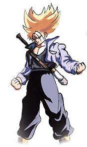
How to Draw Dragon Ball Z (TRUNK)

Kanji de Manga Vol 3 cover image
Now let's try a similar pose, except from a 3/4 view. I'm going to move a little faster this time. Draw the same head, torso, and waist as before, except now turn it a 3/4 angle. Use the center line that runs from the top of his head to the bottom of his waist to guide you. Notice that it should follow the contours of the forms rather than moving straight down in a straight curve. Also notice that the back is arched slightly (indicated by the red line). The same proportions as in the tutorial above should apply, but it will be harder to judge since the forms are at an angle.
Once the main body is positioned, draw in the arms and legs. Again, in this pose the elbows have been pulled back and are foreshortened. For the right arm, the upper section slants inward since it moves away from you, and the lower section slants outward since it moves towards you. For the left arm, both sections are moving away from you, so they both slant inward (make sure the lower half is at an angle from the top half, since his arm is bent, not straight. The legs in this picture are more tapered than in the last drawing, so make them a little thinner near the bottom (but not too thin).


Kanji de Manga Vol 3 cover image
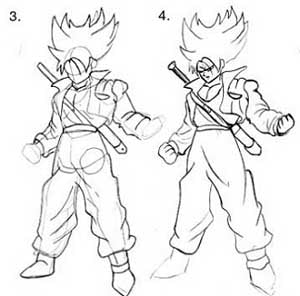
Lightly draw the outlines of the clothing, hair, and any accesories (like the sword). Like other DBZ characters, his pants are very baggy and should gather around the ankles. His shirt is sort of tight and shouldn't look too baggy (in other words, don't have it hang down over the belt and bunch up too much), while his jacket is very thick (the material should look loose and bunch up around his joints).
Erase all unncessary lines and smooth out your final outline. Draw in his hands and face.


Kanji de Manga Vol 3 cover image
You can now take your finished picture and color or shade it however you choose. As always, I used Adobe Photoshop, but you can use whatever you want, as long it is shaded and has some depth to it. Notice that since the pants are so dark, you can hardly see the wrinkle lines that were drawn in earlier; instead, the highlights define the shape.

How to Draw Dragon Ball Z (GOKU)


Kanji de Manga Vol 3 cover image
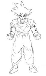
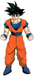
In these tutorials, I will go over how to draw Dragon Ball Z-style bodies. You should be able to use a lot of the stuff here for drawing the bodies of other styles of characters, too. I didn't make up these poses, I took them directly from other DBZ pictures, so you may recognize a few of the more common ones. ^_^
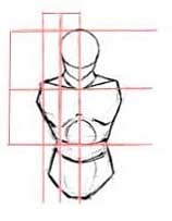
We'll begin with a basic, Dragon Ball-ish pose, and then work our way up to more complicated poses. Start off with the head, torso, and waist. The head is the same shape as in my other DBZ tutorials, just a circle with the lower half of the face added. If you like, you can draw the face first. The only reason that I didn't draw the face first here is because I didn't want to retrace the face that many times. ^_^
The torso is usually relatively large, and wider than the waist. As shown in this picture, the distance from the top of the head to the bottom of the neck is the same as the distance between the bottom of the neck and the bottom of the torso. Also, the distance from the center of the head to the edge of the head is about the same as the distance from the edge of the head to the tip of the shoulder. Hopefully that will help you get the proportions right. I usually add extremely basic muscle definition, just to get a more three-dimensional look and help with the placement of the other forms. Make sure you draw all this very lightly, because you'll be erasing it and drawing over it later.


Kanji de Manga Vol 3 cover image
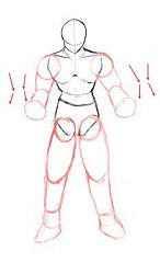
Next, sketch in the basic shape of the arms and legs. Don't worry about the muscles or clothes yet, we'll add those later. Right now, just use sketchy ovals, circles, and cylinders to get the proportions. Use cylinders for the arms, ovals for the legs, and circles for the shoulders, joints and hands. This method may seem awkward at first, but it is a great help in determing the proper length and size of the various parts of the body.
In this picture, the arms don't go straight down. The elbows are pulled back behind him, so that his forearms are level with his waist. Thus, the arms will not be drawn as long as if they were hanging limply at his side. Foreshortening the arms isn't all that difficult, if you think of them just as cylinders. Notice here that with both arms, the top part of the arm slants inward, since it is moving away from you. The lower part slants back out, since his fists are coming towards you. These angles are further exaggerated by the little arrows on the sides of his arms.
DBZ legs tend to be short and stumpy and don't really taper down as much as other characters' legs. Just be careful not to make them too short, or they will look weird. ^_^


Kanji de Manga Vol 3 cover image
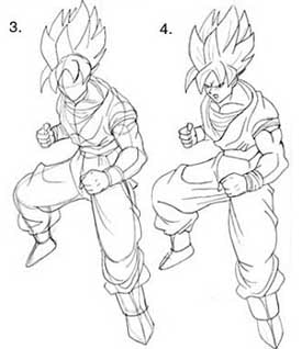
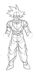
Once the arms and legs are in place, you can begin drawing the details over your rough sketch, such as clothing, hair, and muscles. Folds in clothing can be difficult, but just try to see which way the cloth is being pulled. For example, his pants are very loose and baggy, so it bunches up around his knees and ankles; the folds curve inward and down towards his feet. The material of his belt is stretched around his waist, so the folds are more horizontal.
The way Dragon Ball Z muscles are drawn reminds of a normally proportioned person with flesh-colored water balloons stuck to his arms. ^_~ The muscles are always very big and round, and are shaded to look like they protrude a great deal, like balloons. This is more prominent in Super Saiyajin characters. The point of this is that it might help you to think of the muscles as individual ellipsoids when drawing them. ^_^


Kanji de Manga Vol 3 cover image
Erase all the unncessary lines, leaving only the outline. Add the face and hands, as well as extra details on the muscles and clothes. Clean up your sketch as best as you can.


Kanji de Manga Vol 3 cover image
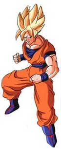
You may now color or shade your picture with a meduim of your choice. Make sure to make the muscles look very round, and make the shadows on the clothes very dark and contrasting.

How to Draw a Body for beginners

 STEP 1.

When drawing a male figure, keep in mind that they are less curvaceous than females. Their bodies are box-like and defined. They have more muscle mass and agility. Their shoulders are broader, creating a sharp and bold physique all together. From the side view, you can see how the body is perfectly straight with no prominent curves like women. The grey line indicates the line of motion or 'balance' for the figures.
 
how to draw a body for beginners step 2

STEP 2.

Here's just a basic overview on three main body types for men. The first one is of course, the muscular or 'body builder'. The body has thin defining lines that indicate tone and definition of muscle mass. As we scale down to the average body, you'll see how the details because less intense. The pink arrows point to the lines which give the figure realism and depth. If you're going to draw a muscular character, I would consider viewing a mass amount of reference photos of muscular men.
 

STEP 3.

Female Anatomy Basics| The difference between drawing female figures, is that females are generally more 'curvy' than males. The hips and shoulders are almost ALIGNED perfectly when compared vertically to one another. It's best to observe references of the female body in motion to get a general idea on how it poses in diverse formats. If needed, get yourself a posable mannequin. Note* A typical height of a female is 6-7 heads. This means, if you stacked the size of their heads vertically, you'd have the average and logical height. Notice how the body is proportioned and the hips almost perfectly aligned with the shoulders. Note that female shoulders DO NOT sharpen and erect perfectly straight like the horridly drawn figure to the right. Observation is key!
 
how to draw a body for beginners step 4

STEP 4.

Breast Variations| Now, here's a quick front and side turnaround on how diverse sizes of breasts can take affect on the figure. We have the very small, average, above average, and large DD cup breasts. Because gravity is continuously active on objects; the breasts will sink downwards with a sort of protrusion at the tips (nipples). NEVER draw breasts bulging outwards as if there is a force pushing them outwards or upwards, as shown in the figures demonstrated in grey. Also, keep notice on the patterned lines that trim the middle of the breasts on each figure. This dictates how overlaying objects will morph within the shape of its parent (clothes, accessories, etc
 

STEP 5.

When drawing clothes on bodies, it's critical to keep in mind that clothing has different effects on the female and male bodies. It's also important to know the differences and principles of drawing these opposite genders. I would suggest heading over to my "how to draw anime bodies" tutorial that will teach you very basic limits on the female and male bodies. Again, females have curvier bodies, and of course 'breasts'. Their shoulders are also softer and smaller than men. Notice how male bodies are sharper with very broad shoulders. This is because, men are built to provide for the women; which means hunting, fighting, and traveling requires strength and endurance. Again, reference and observe!
 
how to draw a body for beginners step 6

STEP 6.

To begin this clothing tutorial, I would like to discuss the various types of bodies, and how they effect the clothes worn. Here we have three different bodies; one is stubby and chubby, the other is the average lean man, and the last is a muscular body builder. Observe carefully on how the same styles of clothes are effected by the shapes of the bodies. Notice that the stubby body has less wrinkles with slight indication of wrinkle at the tightest regions. The clothes stick to this body shape, emphasizing the features a lot more than the average body figure. Now, moving onto the middle figure, we see that there's a nice amount of wrinkles in the most active areas. The next figure, which is the muscular man, has the same application as the stubby body. The clothing sticks to most protruding part of body, which are obviously the muscles. The wrinkles are also stretched around the biggest of muscles. To further your observational skills, study lots and lots of references on how clothing effects the many varieties of bodies!
 

STEP 7.

Begin by drawing the body guides to create a workable frame. First, draw the head guide shape, then the torso and hip guides. Sketch in the guidelines for the neck, arm and to connect the top to the bottom.
 
how to draw a body for beginners step 8

STEP 8.

Using the guide you just made, draw the shape or define the shape for the girl's face. When that is done you can draw in the bang and some hair.
 

STEP 9.

We will now tackle the task of drawing out the body starting with the neck, shoulders, arms and then the torso. This is a female so the chest needs to be drawn in a feminine manner.
 
how to draw a body for beginners step 10

STEP 10.

We will add a top. For this female model it's a simple halter. Add the cleavage and then draw the collar bones.
 

STEP 11.

We will sketch out the rest of the body shape beginning with the back arch, then draw the butt shape and then finally the thighs and crotch. Don't forget to draw the forearm as well.
 
how to draw a body for beginners step 12

STEP 12.

Finish off this lesson by drawing the left arm and then her right hand or fingers. We will sketch in some detailing to add realism to the body like the bellybutton, and bone definition for the pelvic area. Sketch in a hairstyle you like or draw the short cut you see here. When you are happy with your drawing you can erase the mistakes and guides.
 

STEP 13.

That's it, you are all done. Now you can color in your body drawing or use what you've learned to make your own character/figure.